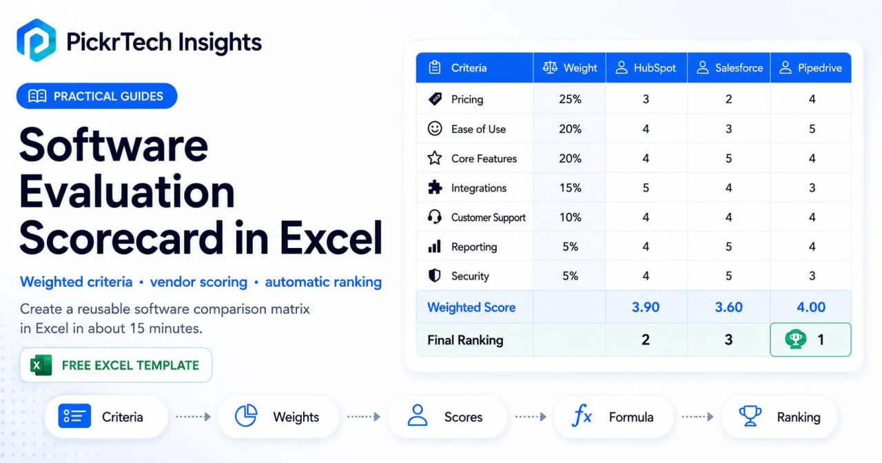
TL;DR: Build a reusable weighted scorecard in Excel to score and rank a shortlist of software vendors. Set your evaluation criteria, assign importance weights, enter scores, and let formulas calculate weighted totals and surface your top option automatically. You can have a shareable decision tool ready in about 15 minutes — using the free Excel for the Web.
What you need before you start
Account requirements: A free Microsoft account. Excel for the Web costs nothing and includes everything this scorecard needs — formulas, conditional formatting, sheet protection, and live co-authoring — plus 5 GB of OneDrive storage. No paid Microsoft 365 subscription required. (Feature availability checked July 2026.)
⚠️ Heads up before you build: two things work differently in the free web version than in desktop Excel. You can’t save files as .xltx templates in the browser — Step 7 shows a master-copy workaround that does the same job. And sheet protection lives under Review > Manage Protection, not the right-click menus you may know from desktop. Neither limitation blocks this build; you just need the right clicks.
Data to gather beforehand:
- List of 2–5 software vendors you plan to evaluate
- A rough idea of your evaluation categories — Step 1 includes a starter list of the most common ones to adapt
- Internal priorities: which factors matter most? Pricing constraints? Team-size compatibility?
Permissions and access:
- Sign in to your Microsoft account
- Create a new workbook in Excel for the Web
- Share the file with team members if the decision needs group input
Estimated time: 15 minutes solo; about 30 if you set weights with the team.
Difficulty level: Beginner
Cost: Free
Build the scorecard step by step
This walkthrough builds your scorecard from scratch. By the end, you’ll have a working tool that consolidates vendor scores and surfaces your best option automatically. If you only have time for one part, make it Step 2 — the weights are the actual decision, and the rest is mechanics.
Step 1: Open a new workbook and define your criteria
Go to excel.cloud.microsoft and sign in with your Microsoft account (or sign in at microsoft365.com and open Excel from the app launcher). Click “New blank workbook.” The file saves automatically to your OneDrive.
Start by labeling your criteria. In cell A1, type “Evaluation Criteria”. Then in cells A2 through A8, enter the 5–7 categories that will form the basis of your comparison. Depending on your industry, critical criteria might include:
- Pricing (subscription cost, implementation fees)
- Ease of Use (learning curve, UI intuitiveness)
- Customer Support (response time, availability)
- Core Features (do the core functions solve your problem?)
- Integrations (connects with tools you already use)
- Reporting & Analytics (dashboards, data export)
- Security & Compliance (data protection, certifications)
Keep the list focused. More than 10 criteria dilutes the decision and wastes time; when someone insists on adding one, ask which existing criterion it should replace or merge with — that forces prioritization. Your chosen criteria should directly reflect what your business needs from the software.
Expected result: Column A contains a clear, vertical list of 5–7 evaluation categories. You’ve narrowed the focus to what truly matters.
💡 Pro tip: Involve your team when defining criteria. Sales might prioritize ease of use, while finance cares about pricing and reporting. Getting input upfront prevents scope creep later.
Step 2: Assign weights to each criterion
Not all criteria are equally important. In cell B1, add the header “Weight (%)”. In cells B2 through B8, assign a percentage value to each criterion that reflects its importance to your decision.
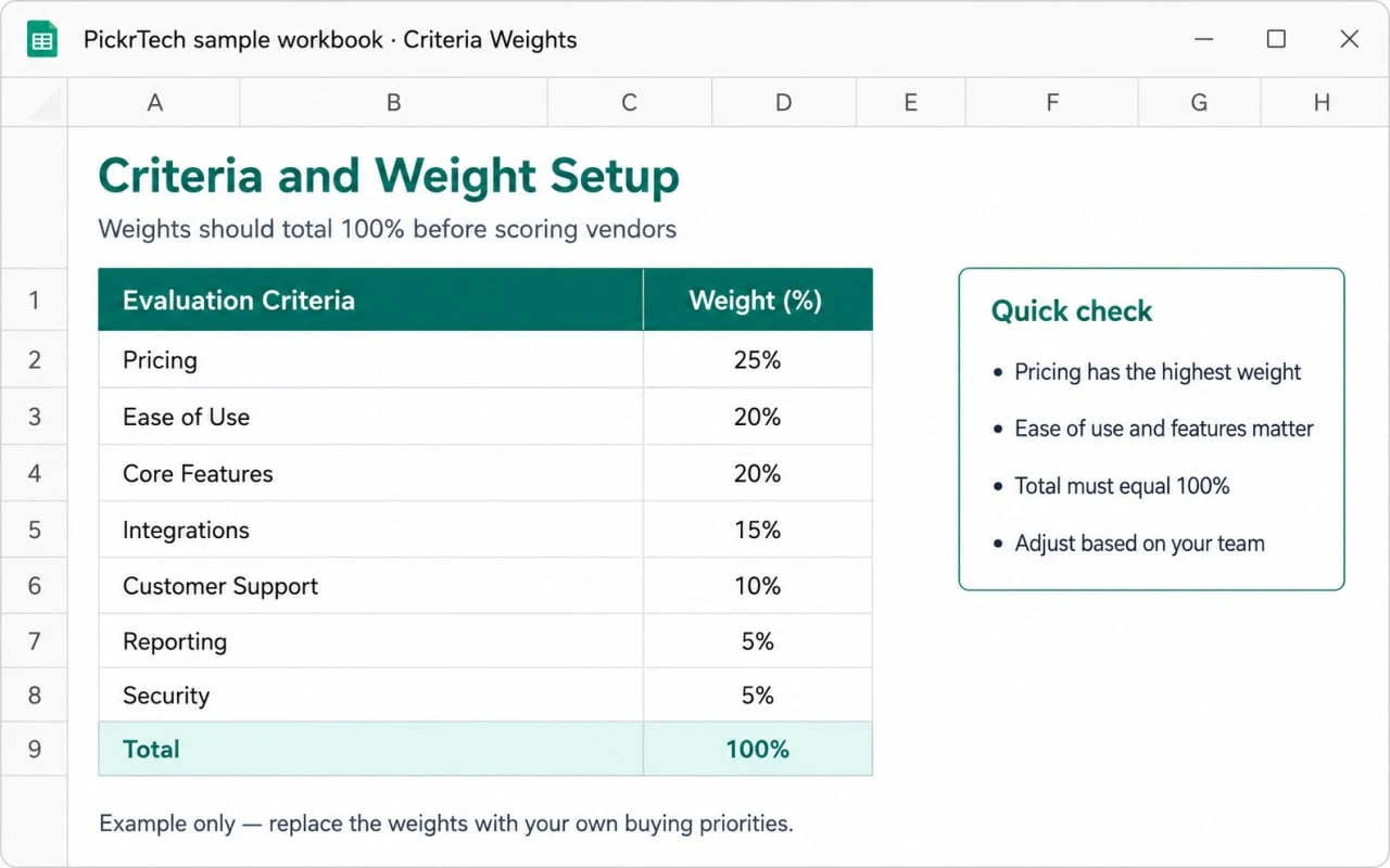
For example:
- Pricing: 30%
- Ease of Use: 25%
- Core Features: 20%
- Customer Support: 15%
- Integrations: 10%
The percentages must total exactly 100%. To verify, click cell B9 and enter =SUM(B2:B8). It should display 100%. If it shows anything else, adjust individual weights until it does.
Resist the urge to weight everything equally. Splitting weight evenly across seven criteria quietly claims that price matters exactly as much as support, which is rarely true — and the argument over unequal weights is exactly what clarifies what your business actually values, not just what it claims to value. A bootstrapped startup might weight pricing heavily (40%) while a large enterprise prioritizes support (25%) and features (35%).
One rule matters more than the numbers themselves: lock the weights before anyone enters a single vendor score, and keep the B9 check at 100% from that point on. Once scores are visible, it’s tempting for a favorite tool’s fans to quietly nudge the weights until their pick wins — which turns the scorecard into a justification machine instead of a decision tool.
Expected result: Column B contains percentage weights that total exactly 100%. You now have a mathematical foundation that reflects your business priorities.
💡 Pro tip: Use round percentages (10%, 15%, 20%, 25%, 30%) for simplicity. Weights like 17% or 23% rarely add precision and complicate mental math during discussions.
Step 3: Set up your software vendor columns
Each vendor gets two columns: one for raw scores, one for weighted scores. Starting in cell C1, label the pairs with the vendor name plus the score type:
- C1: “HubSpot Raw” — D1: “HubSpot Weighted”
- E1: “Salesforce Raw” — F1: “Salesforce Weighted”
- G1: “Pipedrive Raw” — H1: “Pipedrive Weighted”
Keep vendor names short but identifiable so there’s no confusion during team discussions. The header row looks like this:
Evaluation Criteria | Weight (%) | HubSpot Raw | HubSpot Weighted | Salesforce Raw | Salesforce Weighted | Pipedrive Raw | Pipedrive WeightedExpected result: Your scorecard has a clear structure with a Raw/Weighted column pair per vendor. This consistent two-column rhythm is what lets you copy formulas across vendors in Step 5 without breaking references.
💡 Pro tip: Give each vendor’s column pair a different light fill color (Home > Fill Color). It visually separates vendors during review meetings without inserting blank columns, which would break formula copying and complicate your formatting ranges later.
Step 4: Create a standardized scoring scale
Define how you’ll grade each criterion so all evaluators use the same standard. Create a reference table at the bottom of your sheet (or in a separate area). Here’s a commonly used 1–5 scale:
Scoring Scale:
1 = Poor / Does Not Meet Needs
2 = Below Average / Partially Meets Needs
3 = Average / Meets Basic Needs
4 = Good / Exceeds Expectations
5 = Excellent / Fully Meets Needs
Document this scale directly in your workbook so every team member references the same definitions. Pair it with concrete anchors rather than leaving grades subjective — for Customer Support, for instance, “1 = email-only with 48-hour replies, 5 = live chat answered within minutes.” A “3” on Ease of Use means different things to different people until you define it, and vague definitions are what let scores drift and inflate.
A 1–10 scale works too if you want more granularity, but the 1–5 scale is simpler for small teams and faster to discuss.
Expected result: A visible scoring key is documented in your workbook. This prevents inconsistent grading (one person’s “3” matching another’s “2”) and makes the final scores defensible during team discussions.
💡 Pro tip: Pair the scale with real examples. For “Ease of Use”, describe: “A 5 means my team needed zero training. A 3 means one 30-minute training session. A 1 means we’d need a consultant.”
Step 5: Input formulas to calculate weighted scores
Now the spreadsheet does the math for you. Click cell D2 — the first weighted score cell for your first vendor — and enter this formula:
=C2*$B2This multiplies the raw score (C2) by the weight (B2). The single dollar sign locks the column to B while leaving the row free. That distinction matters: when you copy the formula down, the row adjusts so each criterion picks up its own weight (B3, B4, B5…), and when you copy it across to another vendor, the reference stays pinned to column B. A fully locked $B$2 would multiply every criterion by the first weight only — one of the most common ways scorecards silently produce wrong totals.
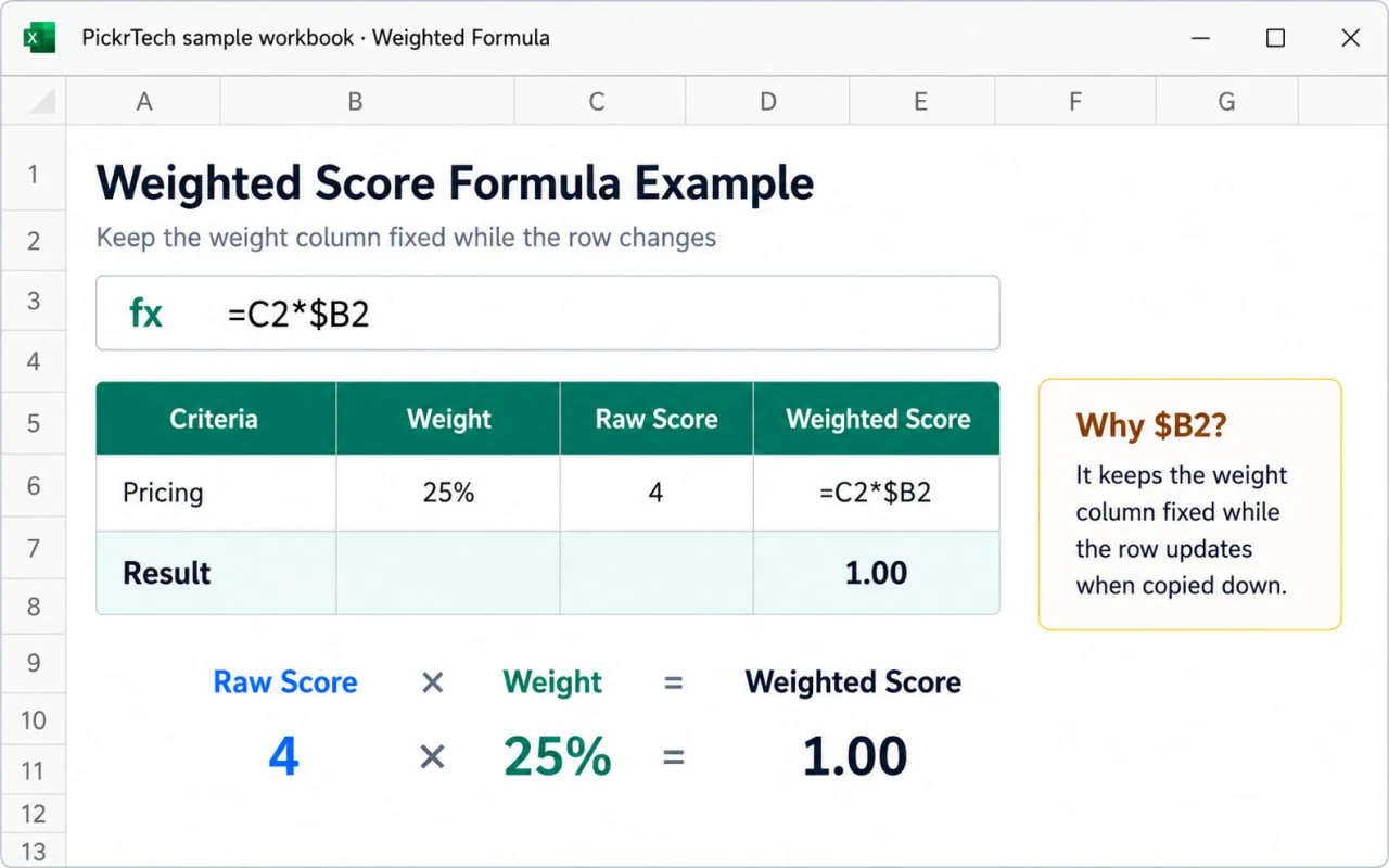
Press Enter. The result shows 0 until you input raw scores — that’s normal.
Now copy the formula to the other weighted cells. Copy D2 (Ctrl+C or Cmd+C), paste into D3:D8 to fill the first vendor’s column, then paste into F2:F8 and H2:H8 for the other vendors. Don’t paste into the Raw columns (C, E, G) — those stay as plain number entry.
Next, add totals. In cell D10 (below your last criterion row), enter:
=SUM(D2:D8)This sums all weighted scores for your first vendor. Copy it into F10 and H10 for the others.
Keep the math simple. Multiplication and SUM are all this scorecard needs — skip IF statements, nested logic, and conditional sums unless you’re an advanced Excel user. Simple formulas are far easier to audit and trust when you present the result to decision-makers. You’re building a tool for a team decision, not a statistical model.
Expected result: Raw scores automatically convert to weighted scores, and final totals calculate instantly as you enter data. The spreadsheet is now a working evaluation tool.
💡 Pro tip: Test the formulas with sample scores before finalizing. Enter a 4 in a row weighted at 30% — the weighted cell should show 1.2. If it doesn’t, check that column B is formatted as Percentage and your formula uses $B2, not $B$2.
Step 6: Add conditional formatting for visual comparison
Your three vendor totals sit far apart — D10, F10, and H10, with raw-score columns between them — so a single color scale across them is awkward to select and manage. Pull them into one contiguous summary table first. In cell J1, type Vendor; in K1, type Final Score. In J2:J4, list your vendors: HubSpot, Salesforce, Pipedrive. Then in K2 enter =D10, in K3 enter =F10, and in K4 enter =H10, so each cell mirrors that vendor’s total automatically.
Now select the contiguous range K2:K4, go to the Home tab, click “Conditional Formatting” > “Color Scales”, and choose a gradient like Green (high) to Red (low).
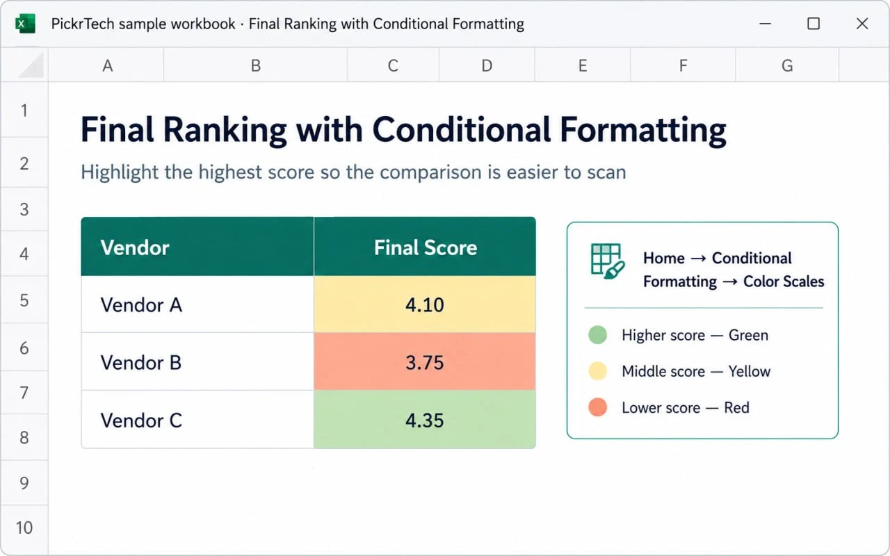
Excel color-codes the three final scores: highest green, lowest red, mid-range between. Because K2:K4 is contiguous, the gradient renders cleanly, and it adapts to your actual data, so it stays relative to the vendors you’re comparing. The summary table also gives you a compact ranking you can screenshot or paste straight into a decision write-up.
Expected result: A compact summary table (J1:K4) shows each vendor’s final score with the Final Score column color-coded — the top vendor is visually prominent. Team members grasp the ranking at a glance.
💡 Pro tip: Resist the urge to heat-map the whole sheet. Applying the color scale only to K2:K4 keeps focus on the decision outcome; too many colors make the spreadsheet harder to read.
Step 7: Test, protect, and save a reusable master copy
Enter sample raw scores (3s, 4s, 5s) into a few cells to verify the math. If your weights sum to 100% and every criterion uses 1–5 scores, each vendor total should land between 1 and 5.
Once the formulas check out, make it reusable. Desktop Excel has a dedicated template format (.xltx), but Excel for the Web can’t save that file type — so use the master-copy approach instead, which works just as well: rename the file “Software Scorecard — MASTER” (click the filename in the top bar), clear out your test scores, and whenever a new evaluation starts, open the master and choose File > Save a Copy (or Save As > Save a Copy in OneDrive). You work on the copy; the master stays clean. If you do have desktop Excel on one machine, you can download the file and save it as a true .xltx there — but nobody needs to.
Optionally, protect the formulas before sharing. In Excel for the Web, go to Review > Manage Protection. In the task pane, turn on “Protect sheet” — this locks the whole sheet by default. Then, under “Unlocked ranges”, add a range name like “Scores” and enter the raw score cells: C2:C8, E2:E8, G2:G8 (add each as its own range). Team members can now type scores freely while your formulas, weights, and totals stay locked. A password is optional; for accidental-edit protection within a trusted team, you can skip it.
Expected result: A verified master scorecard lives in OneDrive, formulas protected, ready to copy for your current evaluation and every future one.
💡 Pro tip: Add a “Comments” column (column I, say) so evaluators can record why they scored a vendor a certain way. “Pricing” might score a 2, but the note “expensive for our small team” explains the rating and surfaces concerns during decision meetings. If you add it, include I2:I8 in your unlocked ranges.
Prefer to start from a ready-made copy? Download our master scorecard workbook (.xlsx). It includes percentage weights, 1–5 score dropdowns, blank-safe weighted-score formulas, automatic totals, sample vendor data, a scoring key, and conditional formatting. The downloadable workbook uses a polished layout with its scorecard beginning lower on the sheet, so its exact cell addresses differ from the build-from-scratch example above. Open it in Excel for the Web, choose File > Save a Copy to your own OneDrive, then replace the sample criteria, weights, and vendor names before scoring.
Common problems and how to fix them
Anticipating these issues saves you time during setup and helps you troubleshoot quickly if something doesn’t behave.
| Problem | Cause | Fix |
|---|---|---|
| The SUM of the Weight column shows 0% or a #VALUE! error | Weights were entered as text instead of numbers | Select the weight cells, set the number format to Percentage (Home > Number Format), and retype the values as numerals |
| Every weighted score uses the same weight, so totals look wrong | The formula locks both row and column ($B$2), so copying down never advances to the next weight | Change the reference to $B2 (column locked, row free) in D2, then re-copy the formula down and across |
| Copying the formula sideways produces #REF! or pulls the wrong column | The weight reference has no column lock at all (plain B2) | Add the dollar sign before the column letter — $B2 — so the reference stays on column B when copied across vendors |
| Conditional formatting highlights only one cell or the wrong cells | The color scale was applied to the non-contiguous totals or a range that includes raw columns, instead of the K2:K4 summary column | Build the J/K summary table (K2 =D10, K3 =F10, K4 =H10), select the contiguous range K2:K4, and re-apply the color scale |
| Team members can’t type raw scores after you protect the sheet | The raw score cells weren’t added as unlocked ranges before protection | Open Review > Manage Protection and add C2:C8, E2:E8, and G2:G8 under “Unlocked ranges” while “Protect sheet” is on |
Check the scorecard before you use it
Run through each item before using the scorecard with your team.
- ✅ All 5–7 evaluation criteria are clearly listed in column A
- ✅ Percentage weights in column B total exactly 100% (check cell B9)
- ✅ Each vendor has a Raw and a Weighted column pair, clearly labeled in row 1
- ✅ Weighted formulas use the column-locked reference ($B2) and totals SUM correctly — test: a raw 4 at 30% weight shows 1.2
- ✅ The J/K summary table is built (K2 =D10, K3 =F10, K4 =H10) and conditional formatting is applied to K2:K4, showing a color gradient from highest to lowest
- ✅ Sheet protection is on (optional) with raw score cells listed as unlocked ranges in Review > Manage Protection
- ✅ A clean master copy named something like “Software Scorecard — MASTER” is saved in OneDrive
- ✅ The scoring scale reference (1–5 or 1–10) is documented somewhere visible in the workbook
When a spreadsheet isn’t the right tool
Scenario 1: Your team needs real-time collaboration across multiple locations
Excel for the Web handles live co-authoring, but if five people need threaded discussions, audit trails, and structured commenting around each score, dedicated SaaS evaluation platforms do that better. If your shortlist is CRM tools, our CRM software guide pairs well with this scorecard.
Scenario 2: You’re evaluating 10+ software vendors with 15+ criteria
Excel gets unwieldy at that scale. The spreadsheet becomes hard to navigate, and manual data entry breeds errors. Dedicated vendor evaluation platforms include pre-built criteria libraries, automated scoring, and reporting that save real time when evaluating many options.
Scenario 3: You need to pull live data from vendors’ pricing pages or APIs
If you want the scorecard to auto-refresh pricing or feature availability from vendor websites, Excel’s manual entry becomes a bottleneck. Automation tools or procurement platforms that integrate directly with vendor systems fit that need better.
For most small business teams evaluating 2–5 options, though, Excel wins on efficiency and transparency. You control the criteria, see every score, and can justify every decision. The trade-off is manual data entry — but for a one-time evaluation, that trade-off usually favors Excel’s simplicity.
Frequently asked questions
Can multiple people score vendors at the same time in Excel?
Yes. Share the OneDrive file and Excel for the Web co-authors live — you’ll watch scores appear in real time. For larger teams, though, consider having each evaluator complete their own copy independently, then merge into a master. Parallel scoring prevents one person’s high score from anchoring everyone else’s judgment.
What should we do if two vendors tie in the scorecard?
Look past the total to the breakdown. If A and B tie overall but A scores 5 on your highest-weighted criterion while B scores 3, A is the safer choice. You can also split the tied criterion into sub-scores (break “Ease of Use” into “dashboard usability” and “learning curve”). Don’t change the weights to break a tie once scores are visible — that reopens exactly the bias the scorecard is built to prevent. Instead, fall back to a pre-agreed tie-breaker (for example, the higher score on your top-weighted criterion) or run a short, focused trial of the two finalists. In practice, true ties are rare after careful evaluation.
Can this scorecard be used for non-software vendors such as agencies?
Absolutely. The framework fits any vendor comparison. Swap in criteria like Price, Portfolio Quality, Communication, Timeline, and References. The scorecard is just a structure — the criteria and weights are what you control.
How should leadership be involved in software scoring?
Have the people who’ll use the software daily score first and independently. Then run a facilitated review where leadership asks why certain vendors scored low on high-weight criteria. This keeps decisions grounded in data your team collected rather than hunches. Often leadership’s gut aligns with the numbers — and when it doesn’t, the scorecard gives everyone shared language for the conversation.
When this scorecard actually helps
A software scorecard is most useful when a team needs to turn vague preferences into a repeatable decision process. Its value is not just in assigning numbers. The real benefit is forcing everyone involved to agree on the criteria before the tool debate turns into opinion, habit, or brand bias.
This approach works especially well when you’re comparing a manageable shortlist and need a structured way to weigh cost, integration fit, usability, and operational risk. It’s less effective when teams treat the spreadsheet as a substitute for real testing. A scorecard can narrow the field and improve alignment, but it can’t tell you how a tool behaves inside your actual workflow unless you pair it with a trial. If Airtable rises to the top, for instance, pair the scorecard with our Move from Spreadsheets to Airtable walkthrough; if the scorecard confirms you’ve outgrown manual contact tracking, the next step is to move from spreadsheets to a CRM with a clean field-mapping and import process. Comparing storefront platforms? Test the real tradeoffs with our Shopify vs WooCommerce vs BigCommerce guide.
- Use this scorecard when you need to compare a shortlist more consistently than informal discussion allows.
- Don’t rely on it alone when setup complexity or workflow fit can only be judged through hands-on use.
- Best next step: score first, shortlist second, then validate the winner in a real trial.
Sources and notes
- Microsoft support: Subscription vs. free web apps — used to verify free access to Excel for the Web with a Microsoft account and included OneDrive storage
- Microsoft support: Protect a worksheet — used to verify the Review > Manage Protection workflow and unlocked ranges in Excel for the Web
- Microsoft Q&A: Saving templates in the web version — used to confirm .xltx template creation requires desktop Excel
- Microsoft support: Overview of formulas in Excel for the web — used to verify $B2 mixed-reference behavior when copying formulas
- Microsoft support: Use conditional formatting to highlight information in Excel — used to confirm color scale application
- Microsoft support: SUM function — used to confirm aggregation formula syntax
Disclaimer
This guide is for general informational purposes only and does not constitute professional advice. Feature availability in Excel for the Web was verified against Microsoft support resources as of July 2026 and may change without notice.
Last reviewed: July 2026 by the PickrTech editorial team.